Studies have shown that colour impacts your mood. It can make you feel happy or sad, excite or relax. Gender, age, and culture also influence how colour impacts your mood.
Understanding colour.
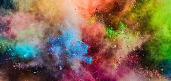
Colours are divided into warm and cool.
Warm colours are similar to those seen in daylight or sunset. The colours range from red to yellow. Browns and tans are also warm colours. People are drawn to these colours because they signal action, optimism, and confidence.
Cool colours are like the grey or overcast sky. They are the blue green through blue violet. Greys are included. Cool colours signal trust, wealth, and wisdom.
Because colour is known to influence mood, it has been studied lots. Advertisers, pharmacological companies, builders, hospitals, and schools all use colour to affect how we feel about products, places, and ourselves.
People and colour.
Blue is the preferred colour for 35% of Americans. Green is at 16%, purple 10%, and red 9%.
People who feel cold like warm colours (reds and yellows). People who are hot like cool colours (blue and green). Women prefer warm colours while men prefer cool colours. This could be because of the different hormones in women and men, or maybe it’s because of gender colour coding. Gender colouring coding is when certain colours are assigned to male or female.
Medications use colour to entice people to use it. Warm coloured pills (red or orange) are for stimulants. Cool coloured pills (blue) are for depressants. Placebos using these colours work only because the patient expects that colour of pill to work a certain way. If the pill is another colour, the patient won’t feel he or she is getting the same benefits of the drug.
How colour impacts your mood.
The following is a short list of colours. Each colour affects mood. But, people also assign certain expectations of trust and behaviour to each colour.
Blue – Blue is a non-threatening colour. It calms and makes you feel safe. Blue evokes feelings of loyalty, stability, tranquility. Logical thinking. Dependability. Used by banks and businesses to make you feel like you trust them.
Red – Red is the quickest colour read by your brain. Red makes you passionate, aggressive, intense. All about power. Used by civil authorities such as fire departments and ambulances. Red comes with anger and danger.
Yellow – Happiness, optimism, youth, creativity. Yellow wants to grab your attention. But it can become too much happiness all the time. That’s why people don’t like too many yellow walls in houses. Yellow can create frustration and anger. Babies cry more in yellow rooms, and people loose tempers more in yellow rooms.
Green – Healing, hope, growth. Freshness. Green energizes and makes you more alert. But green also calms when its used in decorating a room. It’s an easy colour for the eyes, so stores and spas often use it to refresh mind and soul.
Black – Power, mystery, elegance. Also means fear, death, evil, aggression. Black is the colour for depression. The colour black in clothing can feel like a security blanket.
Purple – Wisdom, royalty, spirituality, luxury. Calms and soothes but can also create sadness. Beauty and anti-aging products use purple in their branding.
Brown – Serious, stabile, natural, reliable. Gives out warmth and support for mood.
Orange – Pure energy. Warm, fun, and friendly. Orange brings out enthusiasm. It’s a call to action in traffic signs and advertising.
White – Simple, pure, and clean. It’s not energy nor does it calm. White just leaves you with a medium okay, clean feeling with a sense of protection.
Grey – Neutral, practical, quiet. Emotionless and moody colour. Associated with loss or depression. A grey soul is a soul with no magic or energy.
Find me on twitter @tereziafarkas