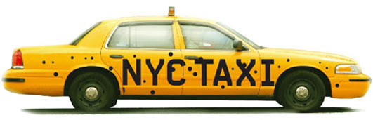
This is the funnest thing I’ve seen on the Internet in quite some time. NYC has a new taxi logo  that’s absolutely hideous. It’s here on the right: NYC is block letters, followed by a circular T in a different type, and then the letters AXI. As a design head, I don’t think it works at all. As a resident of NY, I find it oddly disconcerting. It seems temporary and almost childlike when you see it in person — that must be the one that got repainted after a wreck and is only here until it gets painted properly. Please, only temporary!
So meanwhile, the NYT asked eight designers to critique the new design and come up with ones of their own. Click here to read some of the submissions, and look for the box on the upper right to see some of the others. Above is one retro proposal: All 70’s gangster!

More from Beliefnet and our partners